UX Best Practices
User education
Truv Bridge is a new way to switch direct deposit so majority of users connect their payroll account for the first time. To increase conversion rates we recommend educating your users about Truv Bridge by explaining benefits and setting the right context before initializing Truv Bridge.
Your app
Before showing Truv Bridge, we suggest explaining how Truv works step-by-step and providing user the comfort that the process is private and secure.
Users need to understand how they can benefit from connecting their account. Explaining that they can instantly complete direct deposit split instead of manually updating information with their employer or sending manual forms.
For examples reach out to [email protected].
Truv Bridge
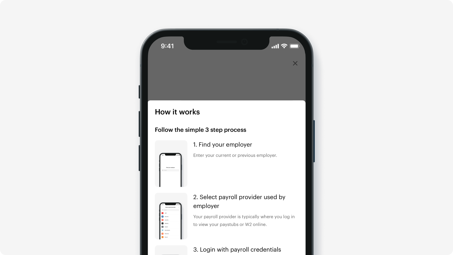
If explaining benefits and setting context doesn't fit into your application UI, you can use "How it works tutorial". Visit White labeling section in dashboard to enable the screen in Truv Bridge.

We recommend to initiate Truv Bridge only after you confirmed that we have Mapping and a partial dollar switch available for the employer.
Plan your UX
When you have information about employer, you can use Search mapped companies endpoint to find company_mapping_id and skip employer search step.
We recommend embedding typeahead search in your application to improve number of mapped companies.

Reach out to [email protected] for suggested UX and copy.
Successful connection
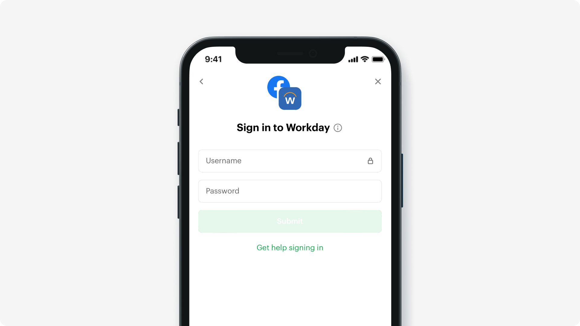
Show successful status and let user close the Bridge right after login (takes 5-10s on average). You would need to subscribe to Webhooks or poll Truv's backend API to check the status of the data readiness.
The best practice is wait only for the login to succeed and send a notification to the user when their account was successfully switched.
Unsuccessful connection
If user was not able to connect their account, best practice is to present an alternative way of switching direct deposit by showing a manual form or another method.
Updated almost 2 years ago